What is a music video?
Content analysis of music videos from chosen genre


Music video analysis
Pretty Hurts is a song recorded by Beyoncé for her self-titled album. The video is like a documentary, showing the struggle of a beauty pageant girl and the experiences she goes through. The song has a powerful message to it, with the video adding to this even more so.
Beyoncé, as an artist, fits the pop and RnB genre perfectly with the song and video. The video mainly targets a female audience and addresses societies idea of girls having the perfect image, including what pageant girls go through to live up to their expectation. There are eight different costumes and looks throughout the seven minute long video. These range from being dressed up for the pageant or completely stripped from makeup and hair styles. The costumes help make the video what it is and having the different personalities of Beyoncé shows a representation of this sort of life style.
Her behaviour is very serious as the lyrics and video sends out a powerful message. Different scenes within the video represent this. For example, there is a scene where the pageant organiser/coach judges her posture whilst weighing and measuring her, turning her away, insinuating that she is overweight. This is in front of a large group of other contestants and the close up shots of her reaction to this has an effect on the audience.
This, consequently, leads to a scene nearer the end where she makes herself sick and another model is seen eating cotton wool, in order to make herself look ‘thinner’ or ‘more desirable’. Including these scenes in her video is a massive risk from Beyoncé as they could be considered disturbing or upsetting. Teenage girls can identify with subjects like this, dealing with bulimia or a similar situation.


However, she is just being
real. Situations like this do happen and it is not being glamorised, from the
lyrics used and the expressions on her face you can see she is unhappy with
what is occurring.
Beyoncé is a pop and R&B music artist. A powerful message can be put across successfully within R&B and Beyoncé usually creates emotional videos such as If I Were a Boy and Broken-Hearted Girl, shot in black and white and 1+1, all emotionally involved videos.
Beyoncé is a pop and R&B music artist. A powerful message can be put across successfully within R&B and Beyoncé usually creates emotional videos such as If I Were a Boy and Broken-Hearted Girl, shot in black and white and 1+1, all emotionally involved videos.


A narrative music video relies
on imagery to produce a story for the audience to follow, often combining a
performance. A bricolage is constructed from a diverse range of things,
different ideas thrown together whether it makes sense or not. However the
video also includes performances of Beyoncé on stage singing in some scenes.
Pretty Hurts is a loose narrative with the whole idea being that in order to be beautiful or reach physical perfection then you must suffer, with varied scenes included to add effect and emphasis to the message being portrayed. The main message of the video is clear however the non-linear element to it shows the different scenes, jumping back and forward in time.
There is not a clear three act structure throughout the video however it begins with Beyoncé extremely unhappy looking into the camera, as if she is looking at her reflection in the mirror. After the video has been playing for 3; 45, the music video stops and diegetic sound starts for one minute. Harvey Keitel makes an appearance as the host of the pageant show where he picks Beyoncé out from the other beauty queens to interview her. He asks “What are your aspirations in life?” in which Beyoncé is shocked at the question. She stutters and repeats the question as she thinks about what to answer. When she answers with “my aspiration in life is to be happy” the scene changes to a different setting, where she has fallen suddenly into water. This is a reference to freedom as it comes across that it has registered within her that she doesn’t need to, nor can she carry on the way she is. Harvey Keitel looks shocked with her reply and it becomes awkward, whereas Beyoncé continues to smile sweetly in to the audience.
With the amount of different settings and costume changes in the video, it can be considered a bricolage however the costume changes do link together with each other and in reference to the message being put across.


The colour palette included in the video has a nostalgic
effect to it as it is supposed to be set in the 1960s within a small-town
beauty pageant. For my colour palette (shown below) I have chosen washed out
colours mainly such as the light grey, washed out khaki and browns to conform
to the nostalgia clearly represented. The dark blue and light pink is
connotations of the beauty pageant from the back drop on stage and lights that
are used on stage as well as the varied vibrant colours of the models dresses.
However there are also modern parts included, such as her outfits in specific
settings.

The lighting is dark during the
performance and stage scenes, with a spot light focussing on the main point of
the shot. For most scenes throughout the
video there is high key lighting to show all important and relevant detail. The
video is powerful and could also be seen as upsetting therefore by having
lighter colour palette and bright lighting subverts this idea.

This long distance shot(above), that
is tracking out, has been used to make it seem as if the audience is there
watching Beyoncé on stage. This particular use of camera shot has been used to
give the audience a perspective and show all of the details of Beyoncé’s
performance. The shot comes across as if the cameraman was sitting in the
audience making it more realistic and successful.

This over the shoulder shot has
been used to get a better perspective of how Beyoncé feels. It gives the
audience an opportunity to see how Beyoncé truly feels on an intimate level. The
shot comes across as if we are in Beyoncé’s head from the extreme close up shot
creating a personal outcome.

This wide camera shot gives the
audience a chance to see all of the contestants on stage together. The
nostalgic effect is also visible in the shot with the costume and non-verbal
communication such as their posture and the way they are standing.
Continuity editing has been used throughout this narrative music video to make it genuine and successfully get the powerful meaning across. It helps to understand the different scenes. With the amount of settings used within this video it is a good idea to use this form of editing to connect with the audience whilst avoiding confusion. Long takes have been used frequently with use of lip syncing along with quick cuts.
Frequent use of long takes and quick cuts has helped the video flow a lot smoother. The quick cuts have been used to highlight the high adrenaline and tension between contestants when getting ready.
Textual analysis of Examples Won’t Go Quietly
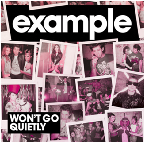
British recording artist Example released his second album ‘Won’t go quietly’ in June 2010 where it went to number one in the UK Dance chart.
The front cover consists of 11 main images printed in a Polaroid style which have been juxtaposition in a collage type way, layered against each other as if they have been positioned on a surface for presentation. All of these images are from a party scene with the artist, Example, in most of them. This is a useful effect for the audience as they can identify the artist easier.
A strong monochrome, block capital title stands out clearly against the Polaroid style photographs and again adds effect to the identification of the artist by the audience.
The effect these connotations have on the albums target audience begins with an eye catching cover. Having lots of different main images instead of one would make someone pick up the album and take an interest in it more.
When it comes to typography, example was clever with using sans serif fonts as it matches with the genre of the album. Using serif with a dance, house electro album wouldn’t of worked whereas the sans serif does. Including the block white capitals on to a black background results in a stand out, distinctive product. Having the same colour and font for both elements of the typography is also successful. Having too many different fonts could result in the album looking messy or unprofessional. The size of the artists name being larger than the name of the album echoes the idea earlier mentioned about the artist being easily recognised with his name in big bold letters.
The overall effect of the album cover is modern, stylish and extremely appealing to the audience with the party scene photographs that are included. Example is a British artist; therefore the images come across as being from a British party scene as the poses that have been captured are unnatural and “caught off guard”. The way in which male and female models are included on the cover adds emphasis to how the genre of music appeals to both genders and therefore a wider range of people within the audience. The idea I get from these images and advertising is an alcohol and drug taking scene however not in raves or out in a public place but more behind closed doors in the comfort of their friends’ homes which has become much more popular within young British society.
The pink effect that is included within all the pictures is consistent across the album cover producing a vintage style as Polaroid’s often appear in this way. The collage style is extremely effective as it shows a variety of different scenes within the different images which is better than narrowing the cover down to one individual photograph.
The mise-on-scene in the images is aimed at a fairly young, fun loving target audience which is shown through props, costumes and the actions of the models creating an ideal party scene. There are not many props used within the images, more models. However, the props used such as large sized sunglasses, a pug and telephone are all random props and have no relation to anything within the music or other photographs. This is effective due to the ‘crazy’ sort of life style Example is trying to portray from his music. His genre of music is Dance and House which have the lifestyle connotations of non-stop partying, drugs, DJ’s and lots of colour. Having a number of different props with no relevance conforms to this idea and expresses it through the album cover. The lighting is fairly low within the images with some lights shining faintly in them to contribute to the party.
When it comes to Dance and House I have two different ideas of the sort of look that is expressed from it. One is very stylish and well presented, girls getting properly dressed up with face paints and stylish outfits. Reminding me of festivals such as V Fest. Appearance being a large part of the events and lifestyle. However there is also another idea of underground parties and the rave scene. This could be seen as a lot grottier than the first described idea. I get the feel that Examples album cover is more similar to the underground idea. The images conform to this idea with the setting, looking fairly abandoned from what the viewers can see of it. Costume that is worn plays an important part in how the album cover is represented. Most of the costumes worn are casual and relaxed, adding to this abandoned impression. Example features in most of the images, surrounded by girls conforming to the ‘Jack the lad’ style that he tries to include in his music.
The nonverbal communication also supports the Jack the lad impression by being surrounded by girls in most images. Example tries to include this style in most of his music. His songs and lyrics are never serious and mainly around relationships and girls however do not have a serious or deep meaning behind them.
The album cover conforms to the conventions of the genre of music it is from. Dance and House can be a way of relaxing to the sort of people it targets. Listening to it in their spare time and going to their favourite house artist gigs has an effect on the lives of the target audience. The album cover has a pink tone which connotes love and romance which could conform to the majority of his songs to be about love and girls but could also subvert this idea, coming from a male artist and talking about relationships could be expressed as tongue in cheek.
Rihanna print advert analysis

Loud is Rihanna’s fifth studio album, released in November 2010. The main image is a glamourous mid shot of Rihanna with a constant colour scheme of pinks and reds. Her bright red hair was iconic during this time with a large amount of girls following the trend. Props used are the vintage sunglasses that Rihanna is wearing, this gives the whole advertisement a 1960s/70s look which works well with the modern style of the rest of the poster. The simple rings which she is wearing do not take the focus away from the other important parts of the poster. However, the large rose between her fingers is a main focus. The non-verbal communication of which it is placed between her fingers as if she is smoking could connote how she is inhaling the beauty of the rose. This could then further connote how the audience are then inhaling Rihanna’s beauty. The Rose is crisp and perfect, seeing major detail of the inside layers of the flower. It matches in with the colour scheme of the album advert of pinks and reds. Rihanna presents herself as having a very female character which is shown thoroughly in this advert due to these colours and non-verbal communication.
The costume which consists of fur draped around her shoulders and nothing else presents Rihanna as racy and creates a sexual energy. Rihanna presents herself in other aspects of media to be sexy and erotic. For example her music videos for S&M or Disturbia. However, she creates a romantic perspective of herself in videos such as California King Bed and Only Girl in the World. The lyrics and previews of this music video are a replica of this album poster because of the softness of the image. She is not trying to look too sexual but still have that edge to the poster over all.
The costume which consists of fur draped around her shoulders and nothing else presents Rihanna as racy and creates a sexual energy. Rihanna presents herself in other aspects of media to be sexy and erotic. For example her music videos for S&M or Disturbia. However, she creates a romantic perspective of herself in videos such as California King Bed and Only Girl in the World. The lyrics and previews of this music video are a replica of this album poster because of the softness of the image. She is not trying to look too sexual but still have that edge to the poster over all.
